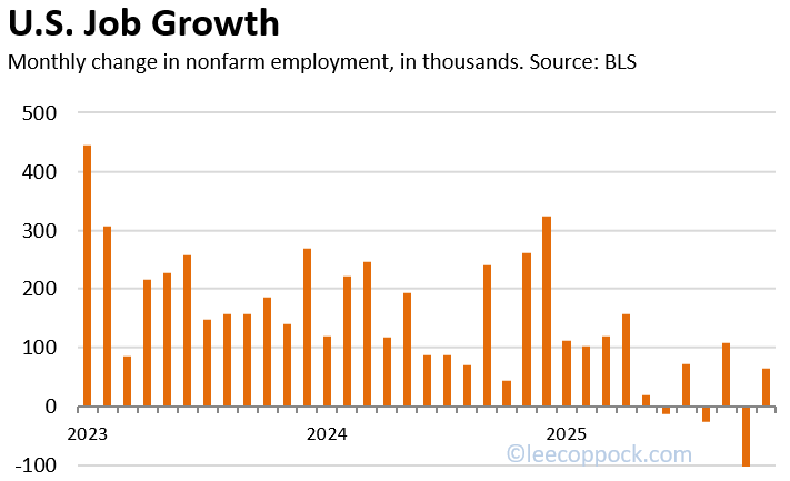
• The Bureau of Labor Statistics (BLS) dropped their monthly jobs report this morning and the employment data is not great, Bob. The unemployment rate ticked up slightly to 4.4 percent. But most concerning is the big decline in total jobs. Nonfarm employment fell by 92,000 jobs in February. This combined with downward revisions to earlier estimates, means that the U.S. economy has not added any jobs (on net) since April 2025. Incredible.

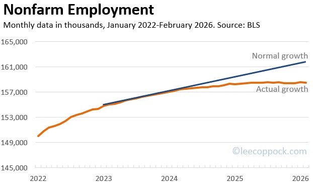
    The graphic below shows monthly growth in Nonfarm Employment since the beginning of 2022. A normal month of U.S. jobs growth would net about 200,000 jobs. You can see that jobs growth slowed considerably since March 2024.

    In fact, since last April, the U.S. economy is actually down about 2 million jobs from a normal rate of growth since last April. The figure below shows total nonfarm employment versus a normal growth trend of about 200,000 jobs per month – with a gap of about 2 million jobs.

    What is causing this dearth of jobs? It is probably a combination of tariffs and AI. On the tariffs front, it is probably not coincidental that President Trump’s “Liberation Day” was April 2, 2025, just about the time the economy stopped adding jobs altogether. While tariffs MAY lead to more manufacturing jobs in the long run, the uncertainty and transition period have left many employers reluctant to expand just yet. And while AI will likely have positive growth effects in the long run, there will certainly be some structural unemployment introduced in the short run.

    Finally, many students will wonder why the unemployment rate is still fairly low. Part of this is the decline in the labor force participation rate, which is now down to just 62.0 percent, from 62.7 percent just two years ago. So workers are leaving the labor force and this keeps the unemployment rate relatively low. Note that it has actually climbed from lows of 3.4 percent in 2023.

    Here is your takeaway:

    • Jobs growth in February was negative 92,000.
    • This contiunes a trend which has led to zero net jobs since April of last year.
    • The unemployment rate rose just slightly and is kept low because of declines in LFPR.
    • The likely culprits are AI and tariffs.

    Let’s hope we have better news next month.

  • The 43-day federal government shutdown last fall led to delays in the release of 2025 GDP data until just today. And that shutdown also affected GDP.

    Real GDP grew at just 1.4% in the fourth quarter of 2025. Part of the reason why growth was because government spending was much lower due to the shutdown. The figure below shows how each of the for spending categories (consumption, investment, government spending, and net exports) contributed to the 1.4% fourth quarter growth rate.

    You can see that the G component reduced GDP growth by almost an entire percentage point.

    For the entire year 2025, this GDP report estimates that real GDP growth was just 2.2 percent, the slowest rate since 2020. Keep in mind, this is just the first estimate, which the BEA calls the “Advance Estimate.” It will likely change as more data becomes available.

  • For decades, people have worried about “peak oil,” the idea that we’d eventually run out and watch modern life grind to a halt. And at first glance, that fear seems reasonable: the world consumes about 37 billion barrels of oil per year! Furthermore, in 1990, there were only about 1 trillion barrels of proven oil reserves in the world. However, get this: proven oil reserves actually grow just about every year! In other words, even though we use a staggering amount of oil, total proved reserves keep rising because we keep adding to what counts as “economically recoverable” oil. The figure below shows OPEC data on total proven reserves by year since 1988.

    This is a nice real-world illustration of the law of supply, and it’s also a reminder that increasing quantity supplied is not always cheap and easy. The cheap oil tends to get found and developed first, often on land, near existing roads, pipelines, and infrastructure. Offshore oil is a different animal. It requires specialized rigs, massive upfront investment, and a floating industrial operation that has to drill, extract, and transport crude in the middle of the ocean. It’s dramatically more expensive than onshore production, which is exactly why it only makes sense when the expected payoff is high enough. Offshore drilling began in the Gulf of Mexico in 1947, but it became a much bigger part of global supply later, especially with the North Sea boom, where major fields discovered in the early 1970s began producing in 1975.

    And if offshore is expensive, Arctic offshore is next-level expensive. In the Arctic, companies face extreme cold, remote locations, short drilling windows, and complex logistics that make projects financially daunting unless prices (and expectations) are strong. In fact, one high-profile Arctic development offshore Norway, Equinor’s Wisting field in the Barents Sea, was publicly described as so costly (over 100 billion Norwegian crowns, roughly $10 billion) that it was paused and later redesigned to bring costs down.

    So no, this isn’t magic, and it isn’t a contradiction. It is the law of supply in action. When prices rise, producers go looking harder, drilling deeper, and spending more to find more oil so they can bring it to the market for you and me. Incentives affect behavior.

  • The Bureau of Labor Statistics is getting back on track with their monthly jobs reports after the government shutdown ended in November. Unfortunately, the labor market data is not allowing them to deliver good news in time for Christmas this year.

    Today’s data release estimates an unemployment rate of 4.6%, up from 4% at the beginning of 2025 (see figure below). The BLS report notes that the unemployment rate “changed little” from September, but these “little changes” are adding up and now it is becoming meaningful.

    Part of the reason the unemployment rate is rising is that overall jobs growth has slowed considerably. The U.S. economy generally adds about 200,000 jobs in a normal healthy month. But Since April of this year, jobs growth has been essentially flat. Today’s report estimates that 64,000 jobs were added in November, but this comes on the heels of new estimates that there was a substantial decline in October, with total nonfarm employment falling by 105,000 jobs. The Figure below shows monthly changes in nonfarm U.S. employment over the past three years. Notice the overall decline in 2025, especially since April.

    This new data indicates the U.S. economy is probably teetering on the edge of a recession. Going onto 2026, it will be important to see a bounce back in jobs growth and no more increases in the unemployment rate.

  • I just came across a cool new paper in which the authors analyze the color palettes of paintings to learn more about the economic growth when the paintings were created. They can actually see strong correlations between economic growth and paint colors. But even more, they use color data to uncover more about actual economic growth in periods where data is is sketchy or incomplete. Wow, this is a cool paper. The title is Colors of Growth, and it is written by four economists: Lars Boener, Tim Reinicke, Samad Sarferaz, and Battista Severgnini.

    They look at European paintings from 1600 to 1820 and they see significant variation in colors used. One reason is that certain colors are easy to attain even when an economy is poor (apparently red is widely available in nature), but other colors are hard to get (apparently a popular shade of blue required lapis lazuli from Afghanistan). In addition, the availability of indoor light comes along with economic growth. Thus, paintings that feature lighter colors indoors help to shown when a population is getting wealthier.

    For example, Figure 4 from the paper (shown below) shows a 20-year moving average of different colors in from British oil paintings. Notice the significant increase in the lighter shades just after the middle of the 17th century. That period corresponds with a period of significant British productivity growth. But then, several political and economic crises led to a growth slowdown at the end of the 17th century and this is also reflected in the paint colors.

    But the authors go on to use their model to actually uncover new evidence of growth and stagnation “that deviate from existing GDP estimates” for Germany and France. Their new color-based evidence is consistent with historical narratives of the period. This raises the possibility that the color analysis can help us find problems with historical economic data. Amazing.

  • Driving across southern Spain recently I was caught off guard by the sheer number of olive groves all over the Spanish mountains. It is much like driving through cornfields in midwestern USA. But these olive trees are built different: they grow all over the sides of rocky mountains and in arid conditions. If you visit Spain, you will be similarly impressed because about 5% of all the land in Spain is used for olive production.

    My wife suggested that we take a tour of an olive farm/factory and this did not disappoint!

    Olive groves in Spain occupy about 5% of the total land area.

    As it turns out, Spain produces about half of all the olives in the world. Pretty impressive. Some of these are eaten as table olives, but more than 90% are used for olive oil. These Spaniards take their olive oil seriously and we are the beneficiaries of this in the USA.

    What is the opportunity cost of olives in Spain? Well Spain is actually a very diverse economy, with total 2024 GDP of almost $2 trillion, which ranks 12th in the world. However, grapes are another land-intensive crop in Spain, occupying about 2% of all Spanish land. Side note: there is at least one student in my macro class this spring whose family owns a vineyard in Spain!

    Vineyards in Spain occupy about 2% of the country’s land area.

    Thus, in Spain, wine is an opportunity cost of olive production, and olives are an opportunity cost of wine. For simplicity, picture a production possibilities frontier (PPF) with olives on the x-axis and wine on the y-axis. The PPF has its normal downward-sloping shape indicating that more olive production means less wine production (and vice versa).

    I did not expect to be so excited about visiting an olive farm, but here we are. Below are two photos I took during my visit. the first shows me happily invading the personal space of some olive trees. The second shows some older Spanish gentlemen at the end of the production line with their fresh olive oil. They look very serious in the photo, but don’t let that fool you – they were even happier than I was.

    Up close and personal with some olive trees in southern Spain.
    Group of older Spanish men working in an olive oil production facility, filling bottles with olive oil and preparing for packaging.
    Don’t let these guys fool you – they were so happy to press their own olives at this olive oil factory.
  • The latest Consumer Price Index data release from the Bureau of Labor Statistics shows prices rose 0.3% in September, putting the 12-month inflation rate at 3.0% — roughly flat compared to August’s 2.9%. In other words, inflation’s not racing downhill anymore, but it’s also not climbing like it did in 2022. Gasoline once again stole the spotlight, jumping 4.1% in a single month, helped along by higher energy commodities and travel costs. Meanwhile, food prices calmed a little, with grocery prices edging up just 0.3%. Shelter inflation also eased slightly, with the rent and owners’ equivalent rent measures growing at their slowest pace since early 2021 — a sign that housing costs might finally be getting the memo.

    Zooming out, the 3.0% annual inflation rate represents a return to something close to normal, though still above the Federal Reserve’s long-term 2% target. After peaking at over 9% in mid-2022, annual CPI has steadily cooled — but energy and housing remain the two stubborn holdouts, occasionally re-inflating like a bad group project that just won’t end. The big picture? Prices are still rising, just not fast enough to set off alarms — unless, of course, you’re filling your tank, buying airline tickets, or grading an econ midterm about “transitory inflation.”

  • Data released by the BLS this week shows that the rate of CPI inflation in the U.S. was just 3.2% in October.  The graph below shows annual inflation rates since 1990.

    Inf 1123

    This is monthly data, but it shows the percentage growth in the CPI over the course of one year. This is how we generally measure inflation, but drastic shifts in this inflation measure are rare because it includes data for the entire preceding year.  In fact, looking at the raw CPI data for October 2023 indicates no change at all for the CPI (zero inflation) for the month of October.

    I like to point out that the battle to reduce inflation has been admirably fought by Jerome Powell and the Federal Reserve.  They have weathered many complaints about potentially rising unemployment over the past year and a half as they tightened monetary policy through interest rate rises.  And yet the unemployment rate in the U.S. is still just 3.9 percent.  

    The Fed's increases in interest rates have reduced the quantity of money circulating in the economy.  The graph below shows the M2 money supply since 1990. 

    M2 1123

    Economists do not all agree on the direct link between M2 and inflation, but they are clearly not unrelated.  That is, many factors might influence inflation in the economy, but the M2 money supply is a clear contributor.

  • On the heels of a great GDP report last week, the jobs numbers released today by the BLS are disappointing.  The good news is that 150,ooo new jobs were added to nonfarm employment. However, since 2020, we have gotten used to much larger increases in employment. For example, in the 12 preceding months, the economy added an average of 258,000 jobs per month.  The graph below shows growth in U.S. nonfarm employment since 2021.  Clearly, the increases are slowing since days just after COVID-19.

    Employ1123

    In addition, the unemployment rate ticked up to 3.9% in October (from 3.8% in September) and the labor force participation rate edged down to 62.7 % (from 62.8%).  Taken together, this is just not a strong jobs report.

    The October numbers may be lower because the survey was taken during major work stoppages — notably the strikes by the United Automobile Workers and related layoffs. Since then, the U.A.W has informed the workers who were on strike to return to their jobs. The union has reached tentative contract agreements with the three major U.S. auto companies.

  • New data released by the BEA yesterday indicates that the U.S. economy is growing at a rapid clip. The first (advance) estimate of real GDP growth in the third quarter of 2023 is 4.9 percent. The graphic below shows quarterly real GDP growth since the beginning of 2021. The growth estimate for our most recent quarter is the strongest in nearly two years!

    GDP2023III

    If we take the GDP growth along with low unemployment rates (3.8% in September), it is clear that the U.S. economy is not struggling right now. 

    Yes, there are some troubling issues on the horizon, like higher consumer debt, high and rising federal budget deficits, and relatively high interest rates.  However, the Federal Reserve has reduced inflation rates significantly over the past 18 months and the the economy still chugs along.